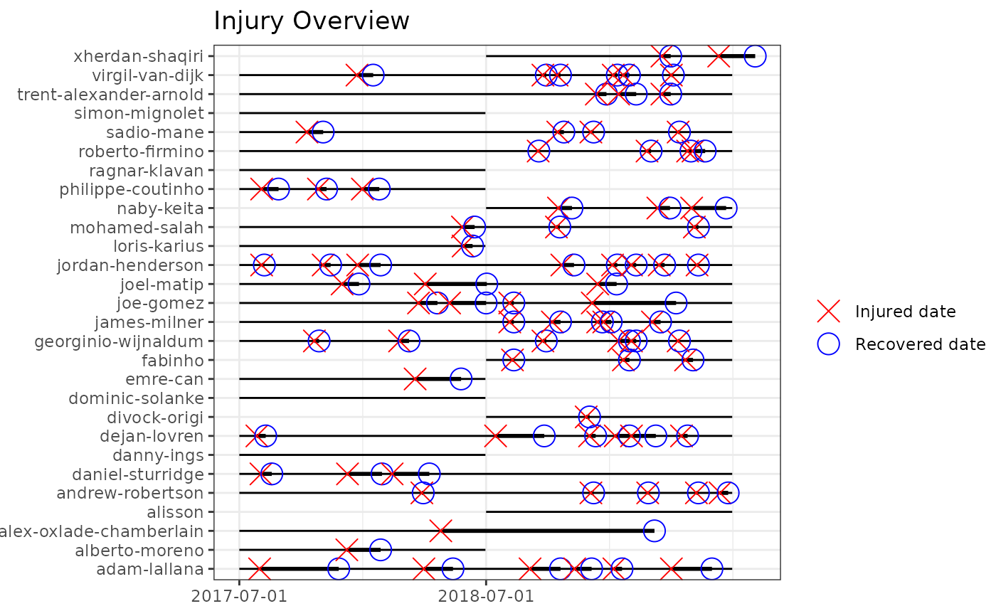
Given an injd S3 object it plots an overview of the injuries
and illnesses suffered by each player/athlete in the cohort during the
follow-up. Each subject timeline is depicted horizontally where the red cross
indicates the exact injury or illness date, the blue circle the recovery date
and the bold black line indicates the duration of the injury (time-loss) or
illness.
Arguments
- injd
Prepared data. An
injdobject.- title
Text for the main title.
- fix
A logical value indicating whether to limit the range of date (x scale) to the maximum observed exposure date or not to limit the x scale, regardless some recovery dates might be longer than the maximum observed exposure date.
- by_date
increment of the date sequence at which x-axis tick-marks are to drawn. An argument to be passed to
base::seq.Date().
Examples
# \donttest{
df_exposures <- prepare_exp(raw_df_exposures, person_id = "player_name",
                            date = "year", time_expo = "minutes_played")
df_injuries  <- prepare_inj(raw_df_injuries, person_id = "player_name",
                            date_injured = "from", date_recovered = "until")
injd         <- prepare_all(data_exposures = df_exposures,
                            data_injuries  = df_injuries,
                            exp_unit = "minutes")
# }

gg_photo(injd, title = "Injury Overview", by_date = "1 years")

