Plot polar area diagrams representing players' prevalence
Source:R/gg_injprev_polar.R
gg_injprev_polar.RdPlot the proportions of available and injured players in the cohort, on a monthly or season basis, by a polar area diagram. Further information on the type of injury may be specified so that the injured players proportions are disaggregated and reported according to this variable.
Usage
gg_injprev_polar(
  injd,
  by = c("monthly", "season"),
  var_type_injury = NULL,
  title = "Polar area diagram\ninjured and available (healthy) players"
)
Arguments
- injd
Prepared data, an
injdobject.- by
Character, one of "monthly" or "season", specifying the periodicity according to which to calculate the proportions of available and injured players/athletes.
- var_type_injury
Character specifying the name of the column on the basis of which to classify the injuries and calculate proportions of the injured players. It should refer to a (categorical) variable that describes the "type of injury". Defaults to
NULL.- title
Text for the main title.
Examples
# \donttest{
df_exposures <- prepare_exp(raw_df_exposures, player = "player_name",
date = "year", time_expo = "minutes_played")
df_injuries <- prepare_inj(raw_df_injuries, player = "player_name",
date_injured = "from", date_recovered = "until")
injd <- prepare_all(data_exposures = df_exposures,
data_injuries = df_injuries,
exp_unit = "matches_minutes")
# }
# \donttest{
library(ggplot2)
our_palette <- c("seagreen3", "red3", rev(RColorBrewer::brewer.pal(5, "Reds")))
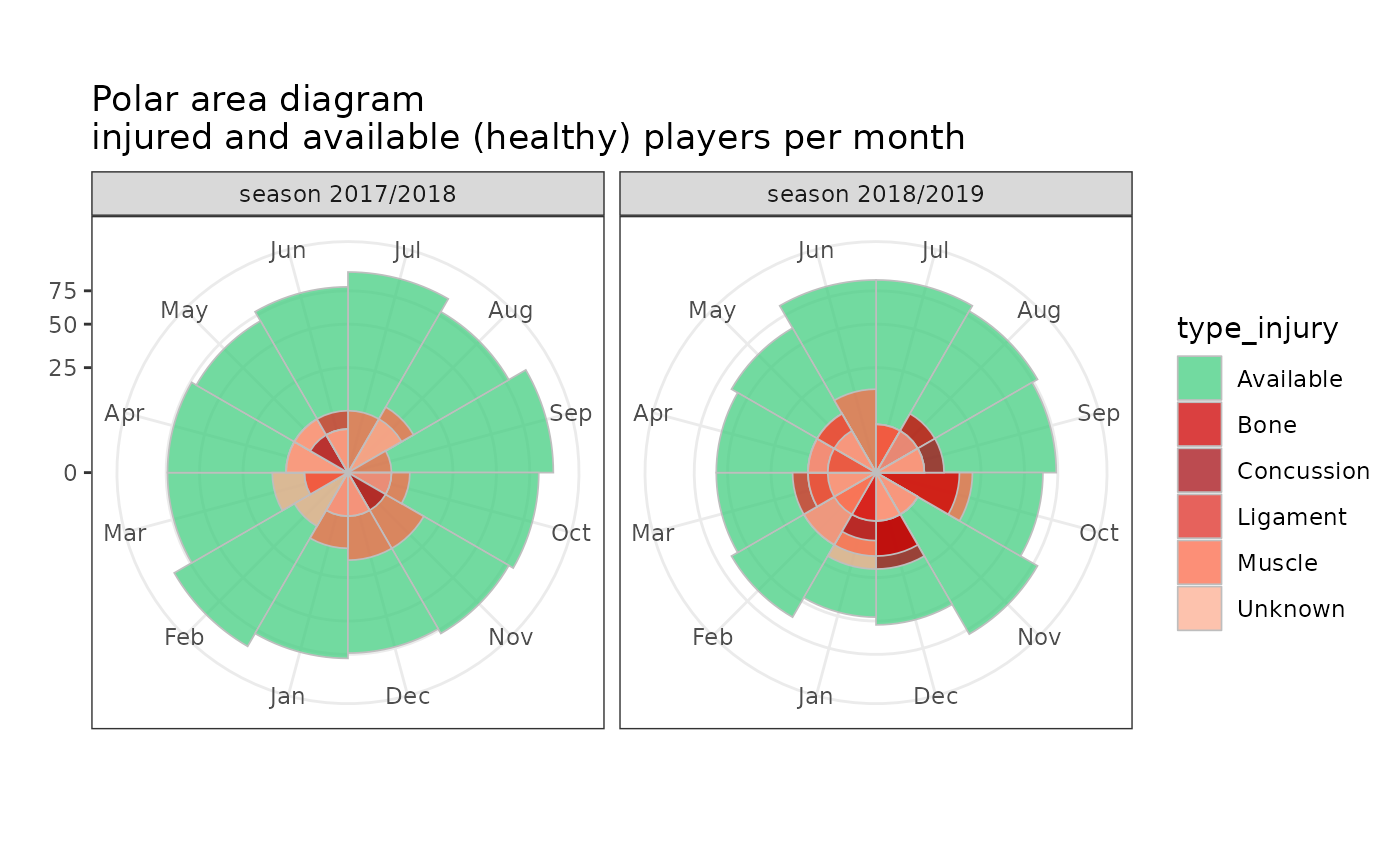
gg_injprev_polar(injd, by = "monthly", var_type_injury = "injury_type",
title = "Polar area diagram\ninjured and available (healthy) players per month") +
scale_fill_manual(values = our_palette)
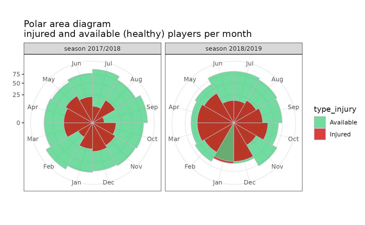
 gg_injprev_polar(injd, by = "monthly",
title = "Polar area diagram\ninjured and available (healthy) players per month") +
scale_fill_manual(values = our_palette)
gg_injprev_polar(injd, by = "monthly",
title = "Polar area diagram\ninjured and available (healthy) players per month") +
scale_fill_manual(values = our_palette)
 # }
# }